Sunday, August 26, 2012
Characteristics of a Champion - A U of M Series
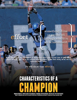
This is a series I finished up about a week ago for the University of Memphis football team. I had a particularly good time with it because it was an idea that I threw to them and they let me run with it. I am quite pleased with the result.
I wanted to take the "TIGERS" nickname and relate each letter in it to a characteristic of a champion. By doing so, I wanted to show that those characteristics define the Tigers program as well, showing their dedication to becoming a championship caliber program. I made each piece into a little mini-poster wit the definition of each characteristic going front and center. I really loved using the curly brackets to frame the definition as it gives a little elegant flair to an otherwise gritty series.
I thought the modern serifed font worked well to give that dictionary feel to the definitions and the subsequent blurb below each one as well. I contrasted it with a nice sans-serif headline font for the title to balance the type in the piece.
I had to let each image reflect the definition being described or else the whole piece would fall apart. I also added a little overlaid texture and high contrast blacks in the background to make them a little more than simply photographs. I also toned their overall density down a little as well in order to help the defintions pop out more.
As I said before, I really loved doing this series and am very pleased with the results. I hope you enjoy the series as well!
Sunday, August 19, 2012
UT-Chattanooga 2012 Football Schedule Poster
I was fortunate enough that UTC came to me again this year to work on their football schedule poster. This time around they had a photo shoot for the poster, which made the pictures extra sharp for me to use. I really enjoyed putting this one together. I wanted to play with a vertical schedule on a horizontal layout and I think it worked out well. I also wanted the attention focused mainly on the coach and players with the schedule playing second fiddle, and I believe that is happening in this poster as well. All in all it was a fun piece that produced an awesome result. I'm waiting to get a few of the printed posters from the university, at which point I will post those images up here as well.
Labels:
Chattanooga Mocs,
MJVID,
Mocs Football,
Schedule Posters,
UTC Athletics
Tuesday, August 14, 2012
U of M 2012 Season Invites
If you can believe it, another football season is upon us, which means it is time for the Tigers season invite to their home games. I did one version for coaches and one for players. All the information is basically the same on both, the only big change being the player picture at the bottom. I had fun with a few filters to get each picture to have the super glossy-gritty combination look on both. It was a fun project as always. I really enjoy working on schedule layouts and hope that this one gets a few players to come to some games!
Subscribe to:
Comments (Atom)


