Tuesday, July 17, 2012

Double MiLB Mascot Madness! (Muddy & Orbit)

Not only was it my fiancee's birthday this weekend, but it was also Orbit's. Therefore, I got the above drawing wrapped up in time to celebrate his awesomeness. I use to have a stuffed animal of him from my first Aeros game that I always loved. I was born in Akron so I have always rooted for the Aeros.They have one my favorite logos in sports because of their unique nickname, intense use of color in their primary mark, and the insane italics in their wordmark. It was a lot of fun to put this drawing together.
I also recently wrapped up this drawing of Muddy, the mascot for the Carolina Mudcats. The Mudcats have replaced the former Kinston Indians as the Indians' High-A Affiliate this season. Muddy was fun to draw because it's not every day you see a catfish walking on two legs in full baseball garb. Also, the Mudcats are the only Indians affiliate close to my neck of the woods here in the southeast, so I had to make sure to represent them well in my continuing quest to draw all the Indians affiliate mascots.

(Disclaimer: Representations of team logos appearing on uniforms are there to capture the mascot as close as he/she appears in real life and I'm not claiming those logos as my work. All credit goes to the designers who have created them.)

Saturday, July 7, 2012

Come on down...and meet Skippy!

I've learned something about myself over the years: If your mascot is lime green, then I'm automatically a fan.

I don't know what it is about that color. It must be the perfect mascot color or something. Therefore, I was insanely excited that one of the Indians' affiliates, the Lake County Captains, had such a mascot, Skippy. Obviously, his lime green pudginess was my favorite part of drawing him. However, I must tip my cap to the team branding as well, as I think their logo set is pretty awesome. I love the lighthouse as the "I" in the Captains wordmark. It fits so seamlessly in the logo that it acts as both an "I" and lighthouse simultaneously. Perfection my friends.

(Disclaimer: Representations of team logos appearing on uniforms are there to capture the mascot as close as he/she appears in real life and I'm not claiming those logos as my work. All credit goes to the designers who have created them.)

Mahoning Valley Scrappers Mascot...Here's Scrappy!

I'm trying to go in order of minor league level in completing my Indians' affiliate mascot drawings. Therefore, first up is Scrappy, the mascot of the Mahoning Valley Scrappers. He's always been one of my favorite mascots and I had a lot of fun putting this drawing together. I particularly enjoy the chain-link necklace and hardhat. It's those little quirks that really help define a mascot and make it just a little different from the rest.

(Disclaimer: Representations of team logos appearing on uniforms are there to capture the mascot as close as he/she appears in real life and I'm not claiming those logos as my work. All credit goes to the designers who have created them.)

Thursday, July 5, 2012

A Little MiLB Mascot Sketching

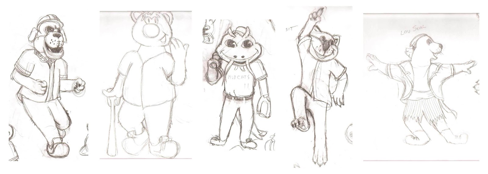
I don't know how you spent your 4th of July, but since it was so wonderfully hot and muggy here in Knoxville I decided to stay inside and sketch a little. More specifically, I decided to sketch out the mascots of my beloved Cleveland Indians' affiliates (yeah, I love the Tribe that much). I plan on coloring each one over the next few weeks.

From L-R*: Scrappy (Mahoning Valley Scrappers), Skippy (Lake County Captains), Muddy (Carolina Mudcats), Orbit (Akron Aeros), Lou Seal (Columbus Clippers)

*In case you were wondering...yes, I was nerdy enough to organize my sketches by minor league class from Rookie-AAA. What can I say? I love the absolute plethora of teams and mascots in minor league baseball.

Tuesday, June 19, 2012

Memphis Women's Clinic


Here is a piece I recently finished for the U of M. It is an invite to their first annual Women's Clinic to help raise awareness about Tiger football. It was quite a challenge to bring a little femininity (say that one five times fast) to a sport that has a largely masculine following. I think overall it turned out very well, as the sans-serif fonts standout on the faded flourished background. I wanted the background to resemble one of those designs you see on purses and handbags, but I didn't want it to be too bold as it would clash with all the information they were wanting to get across. I used the inline font for the title and date to give a little bit of flair to them. I also made them both a shade of pink to highlight them as the main info of the entire piece.

If you'd like to learn more about the event, check out the story (and my piece on the Tigers website) here!

Saturday, June 2, 2012

Orioles Magic...Feel It Happen


I realize that I am posting this illustration while the Orioles are in the midst of a 6-game losing streak, but maybe this guy will turn their luck around. It is a drawing I decided to do for my younger brother as he is a huge Orioles fan and we are also headed up to Baltimore at the end of June to watch the O's take on the Indians at Camden Yards. I had a lot of fun drawing this one, as it was my first full-on illustration I've done in a while. Plus, I just think the Oriole Bird is a pretty awesome mascot.

Wednesday, May 23, 2012

A Roar Like Never Before...


This is the introduction piece I did for the "Roar Like Never Before" series we are gong to start detailing the many changes within the U of M football program for the recruits. I did the intro kind of like a movie poster to make it act like the preview you see before the whole film, the still shot that (hopefully) makes you want to see more. I'm interested to see where it goes and will definitely be posting the subsequent pieces in the series!