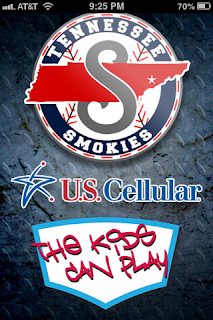
As you can see above, I designed a new loading screen as well as main app icon for the app (and you can see what other sports goodies I follow as well). I really had a lot of fun with this one as I had never created anything to go on a mobile device before. I was very pleased with how well the diamond plate texture came through on each of the items and I hope everyone heads over to their respective app store to check out the new stuff!
Saturday, April 27, 2013
Tennessee Smokies App Graphics
As you can see above, I designed a new loading screen as well as main app icon for the app (and you can see what other sports goodies I follow as well). I really had a lot of fun with this one as I had never created anything to go on a mobile device before. I was very pleased with how well the diamond plate texture came through on each of the items and I hope everyone heads over to their respective app store to check out the new stuff!
Labels:
Android,
App,
Baseball,
iPhone,
MJVID,
Sports,
Tennessee Smokies,
The Kids Can Play
Monday, April 15, 2013
New Entrance Way Signs at Smokies Park
One of the coolest projects I've gotten to work on for the Smokies so far has been updating their entrance way and baseline signage. Below are several pictures showing the final product of the entrance signs coming in on the first and third base sides.
I thought the little curls added an "old-timey" feel of an old ballpark while the sans serif fonts hints to the modern day as well as is highly visible from far away. There will be pictures of the new baseline signs to follow as well, but for enjoy your new entrance into Smokies Park!
Sunday, April 7, 2013
Tennessee Smokies Media Guide Covers
The Tennessee Smokies home opener is right around the corner (Wednesday, April 10th) and I recently finished up the media guide covers for the books that will be used this season. This project was a lot of fun for me mainly because I knew how many other people would have their hands on these books and I wanted to make sure they were holding something awesome.
I've been loving carbon fiber as a texture recently so I used that on both sides along with the red bar to add continuity between the two sides. The same relation can be said about how the names and titles on each side are laid out as well. My favorite part of the piece is the diamond shape on the front on top of the shiny silver background. There is a really nice depth created by the shadow around it that lets that area (and the title and players subsequently) pop just a little more.
As mentioned, with the season just around the corner, I have created some new concourse signage well that should be making an appearance on this blog soon!
Labels:
Baseball,
Graphic Design,
Media Guide,
MJVID,
Opening Night,
Tennessee Smokies
Thursday, April 4, 2013
2003 Southern Miss Baseball 10 Year Annv. Mini Poster
This poster is fresh off the Photoshop line! I wrapped this piece up for Southern Miss this afternoon to help them in commemorating their 2003 baseball team's tenth anniversary. It is a little treat to go along with the celebration this weekend. I really enjoyed creating the the Quick Facts section at the bottom and had fun adding all kinds of textures and photo filters to the main photo to give the poster a little weathered look. Good times as always!
Labels:
10th Anniversary,
Baseball,
Golden Eagle Pride,
Golden Eagles,
MJVID,
Posters,
Reunion,
Southern Miss
Monday, April 1, 2013
This is Tigertown: An Illustration for Memphis Tigers Football
I wanted to include the original sketch to go along with the final digital rendition so you could see what all was figured out in the drawing stage and what got ad-libbed when I took it to the computer. The gray shading came as a secondary thought that I think adds a nice second tone to the image, giving it just a smidge of volume. As you can see from the original layout, I didn't have a guitar head in the mind, but it turned out to be the final touch to make this illustration work and really make "TIGERTOWN" feel like the neck of the guitar. It was a fun little project to work on and I was very happy with the result.
Subscribe to:
Comments (Atom)


