
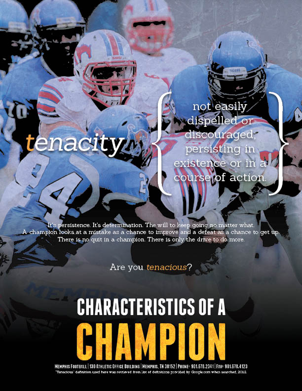


I wanted to take the "TIGERS" nickname and relate each letter in it to a characteristic of a champion. By doing so, I wanted to show that those characteristics define the Tigers program as well, showing their dedication to becoming a championship caliber program. I made each piece into a little mini-poster wit the definition of each characteristic going front and center. I really loved using the curly brackets to frame the definition as it gives a little elegant flair to an otherwise gritty series.
I thought the modern serifed font worked well to give that dictionary feel to the definitions and the subsequent blurb below each one as well. I contrasted it with a nice sans-serif headline font for the title to balance the type in the piece.
I had to let each image reflect the definition being described or else the whole piece would fall apart. I also added a little overlaid texture and high contrast blacks in the background to make them a little more than simply photographs. I also toned their overall density down a little as well in order to help the defintions pop out more.
As I said before, I really loved doing this series and am very pleased with the results. I hope you enjoy the series as well!
No comments:
Post a Comment