

Tuesday, May 28, 2013
Rise to the Top: A Southern Miss Splash Page
New Smokies Park Stadium Signage
There's a new look going up around Smokies Park...my signage! The team has been updating the stadium signage this season to reflect new names for certain areas of the park as well as to give the stadium a general facelift. Being the graphic design assistant for the team, I have played a major part in this. You can see several examples of my work below.
I tried to keep some unifying element between all the signage to make sure each sign ties into the next and that they all feel like they belong together. The curly border lines were carried over from the main entrance signs and adapted for use along the baselines. I then stuck with the team's color scheme to once again keep some signage unity.
This has been one of the most full throttle projects I've ever had the chance to work on and there is definitely a part of me that feels lucky to have had the chance to create these signs. With any luck, these signs will be up for years and years and become part of the memories of so many Smokies fans. It is that chance of creating lasting memories that drives every project I do and continues to push me to make each project better than the last.
BASELINE DIRECTIONAL SIGNS:


CONCESSIONS DIRECTIONAL SIGNS:


BACK-LIT CONCOURSE SIGNAGE:


Tennessee Smokies Gold Glove Series Bobblehead Box Design #1

Three former Smokies won Gold Gloves in MLB last year: Carlos Gonzalez of the Colorado Rockies, Yadier Molina of the St. Louis Cardinals, and Darwin Barney of the Chicago Cubs. Because of that, the Smokies are releasing a Gold Glove Bobblehead Series this season, and it was up to me to design the boxes for them. Each of the players will come in three differently sized boxes based on the bobblehead heights, so I had to create a design that could easily transfer between all three.


As you can see above, I went with a double swoosh design where the white area on the front and back of the box is reversed. On the front, this allowed for a perfect spot to put the name of the player at the top and then the title of the bobblehead series along the side. On the back, the white area worked well to include a biography of the player as well as highlight the sponsors at the bottom.
I used the two side panels to highlight the "collect-ability" of the series, using one side to highlight which one of the set this bobblehead was as well as when the other two will be given away.


Monday, May 27, 2013
Tennessee Smokies: The Process Logo

The radio network wanted a logo to brand the series and yours truly was on hand to create it. I went with the elongated diamond shaped because I like it as a nice border for the logo as well as a hint to a baseball diamond. to really wrap it together though I wanted to include a hint to our geographic location in the Smokies. Thus, the blue mountains in the background came about to wrap the logo together. I thought the piece turned out rather nice, so be sure to check out the series all season long to see the team's story and my logo making several appearances.
Friday, May 24, 2013
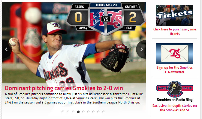
Smokies Website Score Bug
Thursday, May 23, 2013
Smokies Social Media Porch Special Graphic

In creating this graphic, I liked the idea of the title echoing the perspective in the view from the seats in the background. A little happy accident in Photoshop created the cool black-on-red, developing photo look. I thought it worked perfectly with our color scheme so I ran with it. Hopefully we have a great turnout to kick off the unofficial start of summer!
Tuesday, May 21, 2013
CFF Cycle for Life Poster and Postcard
Cycle for Life Postcard:


Cycle for Life Poster:

My usual love of rough textures and fonts work well with the bike race theme and I love the play between the rough sans serif and clean sans serif fonts that I chose. They were fun pieces to work on and hopefully there will be quite a large turnout to the event in a couple months!
Smokies Series Preview Graphic


Wednesday, May 8, 2013
#6KatThePete Graphics


I thought the idea of the empty stadium worked best because it has a calm before the storm feeling to it. It's just sitting there waiting to be jam packed with Golden Eagle fans cheering on the team, and hopefully that all will come true next Tuesday!
Saturday, May 4, 2013
Inside the Tennessee Smokies Game Program
If you purchase a Tennessee Smokies Program at the ballpark this season you will see some of my handiwork while flipping through the pages. I created a few of the ads in this year's program and have included images of them below. My particular favorites are the Wood Bat Showcase and new Concessions Map. I really love the contrast in the bright green field and the deep blues on the concessions map, as I think they play off each other very well to make it an easy piece to look at.


Subscribe to:
Posts (Atom)