Showing posts with label The Kids Can Play. Show all posts

Tuesday, July 16, 2013

4th of July with the Tennessee Smokies

The 4th of July weekend was a busy one at Smokies Park, highlighted by back-to-back-to-back fireworks shows on the 4th, 5th and 6th. The team had an ad for each night in the Knoxville News Sentinel, and it was my task to create the trio for the weekend.

I wanted them all to have a similar look, thus the same bottom info line and background. I included Slugger on the fireworks ad for the 6th to breakup the player imagery that the viewer may have gotten used to by the third day.

My favorite of the three is the first ad that kicked them all off. I knew we wanted to come out with a bang (no pun intended), and I thought the angled text to match the angle of the baseball player worked well to achieve that effect.


As for during the games, I once again pulled out all the stops on our video board head shots for the team. I kept the same concept as the newspaper ads but translated them into a video board format. I really wanted to do something different when it came to the head shots, so I went with the over-sized number to act as anchor point for the eye to got between the stats and player picture. I  then chose for the name to wrap around the number halfway in a clockwise motion to help lead the viewer's eye to the player picture once they read the name.

These are probably my favorite head shots I've done this year, and I have few shown below for you to see (stats are not those of the players shown and are simply for aesthetic purposes):


Saturday, May 4, 2013

Inside the Tennessee Smokies Game Program


If you purchase a Tennessee Smokies Program at the ballpark this season you will see some of my handiwork while flipping through the pages. I created a few of the ads in this year's program and have included images of them below. My particular favorites are the Wood Bat Showcase and new Concessions Map. I really love the contrast in the bright green field and the deep blues on the concessions map, as I think they play off each other very well to make it an easy piece to look at.


Saturday, April 27, 2013

Tennessee Smokies App Graphics


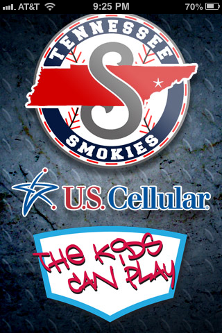
It is certainly a busy time around Smokies Park as the team finishes up a ten game homestand this weekend. With that being said, the team recently updated their app for the season and yours truly was able to help provide some assistance in the graphics department.

As you can see above, I designed a new loading screen as well as main app icon for the app (and you can see what other sports goodies I follow as well). I really had a lot of fun with this one as I had never created anything to go on a mobile device before. I was very pleased with how well the diamond plate texture came through on each of the items and I hope everyone heads over to their respective app store to check out the new stuff!

Monday, April 15, 2013

New Entrance Way Signs at Smokies Park


 One of the coolest projects I've gotten to work on for the Smokies so far has been updating their entrance way and baseline signage. Below are several pictures showing the final product of the entrance signs coming in on the first and third base sides.

I thought the little curls added an "old-timey" feel of an old ballpark while the sans serif fonts hints to the modern day as well as is highly visible from far away. There will be pictures of the new baseline signs to follow as well, but for enjoy your new entrance into Smokies Park!


Tuesday, February 26, 2013

Tennessee Smokies Promotions Graphics


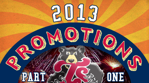
The Tennessee Smokies just released their promotions schedule for the 2013 season and along with it came a couple graphics I created for the release. Part One of the release centered around the team's year-long promotions (Dollar Dog Nights, Fireworks Fridays, etc.). Since the fireworks are a huge draw I wanted to use them as a backdrop in this graphic. I also thought the sunburst idea would be a cool idea to incorporate as it echoes circus tents, state fairs, etc.--all places people go to get away for a little while and have a little fun. I kept the font on "Promotions" loose as well to go with that theme.

On Part Two of the release I stuck with the sunburst design and an old-timey font to keep with the having fun/"Kids Can Play" (the team's season slogan) theme. With the Gold Glove bobblehead giveaways being the main attractions this year, I used their images as little teases at the top. With them just peeking over the top of the title, it references that there will be a giveaway but at the same time doesn't let you know exactly who will be featured. Thus, you have to click through to the article to find out (the whole point in the first place!).

It was great fun creating these images and hopefully we will have packed stands for all of our promotions this season!